Creating the cover for HOUNDED
(Originally published January 14, 2011, on a now-defunct site)
How does a book cover get made? How do we go, for example, from Kevin Hearne imagining his hero, Atticus O’Sullivan…to the final cover image, from which Kevin’s vision for his world blazes forth in all its awesomeness ?
The process begins long before the artist sets digital brush to screen—with an intensely collaborative dialogue between the author, the editor, the art director, and the illustrator. Here Kevin Hearne, author of Hounded, and Tricia Narwani, his editor, reminisce about the making of this cover.
Kevin Hearne: I must confess at the outset to spending two years in college as a graphic design major. I came away from the experience with an eye for detail, a penchant for font snobbery, and an appreciation for the work of those who are far more talented than I. There are those who think that “anyone can be a designer” just like there are those who think anyone can write a bestseller. I am not one of them. I have tremendous respect for creative people and I know first-hand how much it blows when you’re handcuffed with a lot of client instructions. So when it came time to discuss the covers for The Iron Druid Chronicles, I did my best to communicate just two things and let Del Rey take care of the rest. The first thing was what Atticus looked like in my head, and the second was my worry that a hunky male hero on the cover would suggest a romance novel and scare away certain readers who, for whatever reason, didn’t want to be seen reading something perceived as romance. Tricia was on board with that; we were going for a look that would try to walk the line between an action hero and a hunka hunka burnin’ love.
Tricia indicated that Del Rey wanted only Atticus on the cover, none of the supporting characters, so I whipped up a sketch, labeled all the significant parts, scanned it, and sent it on over in time for her meeting with the art director. Here it is:
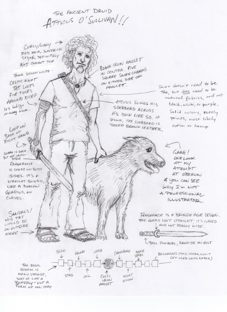
KH: I did a full-body sketch because I had no idea what kind of pose they were going to use, and honestly I didn’t want to know. I had a very good idea of what they wouldn’t use—smoldering looks at the reader and a profound lack of clothing—and that was good enough for me. I also gave them some details regarding his necklace and his sword, because sometimes little stuff like that can really be jarring for the reader if the cover image differs wildly from the text. And then…I waited.
Tricia Narwani: So while Kevin worked hard on his notes on Atticus, I went to work, too, thinking, researching, brooding, obsessing, preparing hardcore for my first conversations with our art director. I had only to think about what excited me about Hounded and Kevin’s work—the action, the humor, the sheer badassery—to know on a gut level what feeling the image and typography should communicate…but as talented as our art director Dave Stevenson is, he can’t conjure a gorgeous cover that perfectly represents Kevin’s vision out of a few abstract nouns. So I set about drawing up some specific notes on a suggested design concept.
First, I wanted something special and distinctive, but that would also reach the right audience. My intrepid assistant Mike Braff and I did a little informal market research, taking trips to local bookstores to see what was out there. We looked at urban fantasy covers and the SFF section, but also at mainstream and YA fiction and even non-fiction, searching for fresh design ideas to inspire us, and for tired, overused ideas to avoid. We also went beyond books entirely, studying other art objects that had that badass “Kevin Hearne feeling”: stylish movie posters for action-adventure movies (The 300, Sin City), punk and metal album covers. Mike sent me dozens of striking album covers for everything from Dio to Sleater-Kinney; I spent one memorable morning trawling three years of archives on a metal blog. We settled on a couple of broad design concepts, along with example images and a handful of suggested fonts.
Since Atticus is so much the heart and soul of the series, its star and main attraction, we thought we should feature him front and center, in a heroic pose. Covers that use digitally altered photos seemed really fresh and contemporary to us, so we suggested requesting a photo illustrator. Monochromatic coloring—one unique color for each book in the series—felt like a way to give the series a distinctive-yet-unified look. And then we envisioned some striking design element that would be unique to the series and set it apart from other urban fantasies: Either a band that would stretch across the front cover, carrying the title, series title, and Kevin’s name, with a medallion bearing a series icon (a wolf’s head, a Celtic knot)—or else the title stamped in a gritty, distressed, metal font, like a thundering opening riff.
But before I spoke to the art director, I presented the notes to Kevin, to get his feedback. I didn’t want us to take a single step in a direction Kevin wasn’t thrilled with. Kevin was excited about our approach, so I met with Dave and shared mine and Kevin’s notes with him.
Dave, to his enormous credit, didn’t run screaming when we hit him with several pages of highly detailed notes! He later came back to me with a some really intelligent questions that sharpened up the concept, including showing me artist Gene Mollica’s work and asking which of his styles I preferred—the “clean” look he often uses for romance, and a “grittier” look. We went with gritty. And then we waited some more.
The first thing we got was this. It was a sign of wonderful things to come. Gene was so devoted to getting Atticus right that he actually had a replica of Atticus’ necklace made!
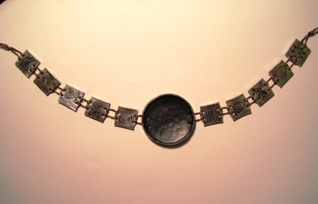
KH: When Tricia sent me this photo of Atticus’s necklace I freaked out a wee bit—but in a good way! I did a little happy dance and made undignified noises because my words were coming to life! I know I’m a writer, but honestly, I can’t do justice to that moment. I can’t tell you how amazing that felt, how surprised I was that Del Rey would go to such trouble, and my complete awe that they hammered out the owl and the otter and everything. I knew then that the covers would exceed my expectations….And I waited some more.
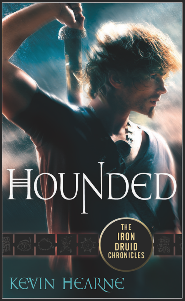
KH: When the first draft of the cover arrived, I was deliriously happy with the way Atticus looked—the hair was perfect, the sword looked great, and the necklace, omg! I showed it around to some of my friends to see if it appealed to both men and women. The guys all wondered whose ass he was going to kick, and the girls all wanted his phone number. Yesss! Victory! I thought the decision to use a version of the amulet necklace as a series logo was inspired and told Tricia that was brilliant. But I did have some suggestions, and I sent poor Tricia a long email about them. Here’s the short version: 1) My font snobbery reared its ugly head. Using a Celtic-inspired font seems like a no-brainer for a series about an Irish Druid, but in this case the fonts didn’t capture the flavor and tone of the series. In fact, the Celtic font suggested a romance novel to me—exactly what I was hoping to avoid—because of the descender on the R in my last name. I asked that they give a big, fat grungy font a try. 2) I also requested that they not use a condensed font for the series title and maybe make the amulet look like hammered iron instead of a plain black circle. 3) Based on the events of this novel, I asked them to change the blue atmosphere to a reddish one. The blue book, I argued, should be the third one, HAMMERED, because much of that novel takes place in a land of ice and lightning. By the same token, Atticus does have to fight some hellish opponents in HOUNDED, so a red atmosphere would make sense. Tricia said cool, thanks, we’ll work on it. And I waited.
TN:I was just as blown away as Kevin was. I loved how Dave had translated our suggestion–the band around the front cover–into an inspired reference to Atticus’ necklace. But Kevin’s feedback was spot-on, so I passed it on to Dave–though along with tons of praise and a virtual hug from Kevin. Because of his hard and patient work with Gene–and his own brilliant design sense–the cover was shaping up beautifully. In the meantime, I also shared the cover with the Del Rey staff, from my fellow editors to publicity, marketing, and sales, to universal cries of joy. (The ladies of Del Rey were also quite especially pleased to meet Atticus). My favorite moment of all: I came back to my office one day to see one of my Del Rey colleagues standing there staring at the cover I had posted over my desk–he’d been walking by, and just had to see what those incredible images were.
KH: Whoa. AWESOME! The red atmosphere really gave the book and the series a sense of imminent menace, and the new fonts and the brick wall erased all hints of a paranormal romance and put us squarely in the realm of urban fantasy. I was happy and knew that I had a cover unlike anything currently on the shelves. Did I send Tricia another long email full of suggestions anyway? You bet I did, because I’m a nerd and obsessed with detail. But most of it was about tiny things that no one would ever notice, and the only thing I really cared about was darkening up the tattoos a bit. They did that for me, plus a couple other small things, and I thought we were finished. I asked Tricia to relay my deepest gratitude to everyone involved and promised to buy a round next time I was in New York; I didn’t think I could possibly be more delighted.
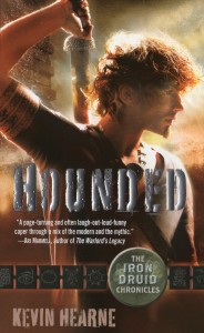
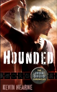
TN: The image shown here is the “sales proof.” It’s the front cover, printed on the same press where we’ll print the final book, with sales and ordering information on the reverse. These proofs are one tool our sales representatives use to get our retail accounts excited about the book. This image doesn’t quite do justice to the silver foil stamping on the title, which glows magically in the light.
KH: Suddenly, there was MORE! Dimly, far off in the distant past, I remembered that Tricia had said they planned to do spiffy things to the cover. But since I couldn’t visualize what she meant without actually seeing it in front of me, I forgot about it. Then she sent me real, printed covers—but with the title stamped in foil and embossed! Now my cover was not only awesome, it was awesome and shiny! I love it and I think Tricia, Dave, and Gene did a fabulous job. They took my suggestions and incorporated them into their own creative vision to make the best cover I could wish for.
And there you have it; for subsequent covers we used the same model and props and created variations on the theme.

