Tag Archives: cover art

TRICKED cover

Oh, my. Cover artist Gene Mollica has surpassed himself. This is so badass! Behold:
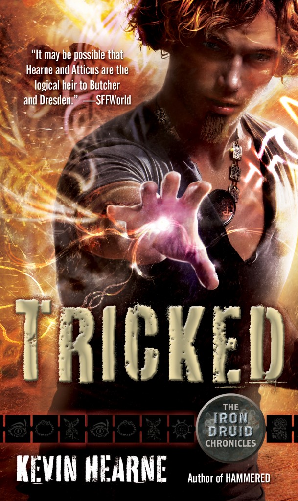
WOOOO! No hidden face. No glaring off-camera. Just straight up I’m-gonna-liquidate-your-401K! I love it!

Apart from Gene’s masterful work, huge kudos also to my editor, Tricia Pasternak, and Dave Stevenson, the designer, for their vital contributions. (For the official cover reveal at Suvudu and to see what Tricia has to say about it, I direct thee there.) I really appreciate them consulting me along the way and tweaking this until I was happy. And they also said it was okay for me to make a wallpaper for your desktop to give everyone around you a shiver of awesomeness! The wallpaper is cropped a smidge wider and you can see more of the beautiful knotwork of Atticus’s binding:
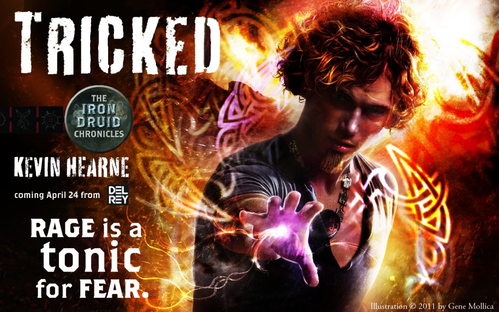
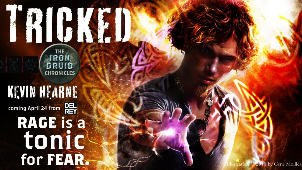
1440 x 700
1920 x 1080

Tricia and Dave wanted to give books 4-6 their own look, slightly different from the first three, and so they started by asking me two questions: What would be a good setting for book four’s cover? What does Atticus’s magic look like?

Much of the book takes place in the Navajo Nation, which is a large chunk of northeastern Arizona, as well as bits of Utah, Colorado, and New Mexico. I’d made a scouting trip up there in order to write the book, and I still had some pictures on me. Tyende Mesa, which is located about ten miles or so southwest of Kayenta, has about five or six buttes jutting up from it—very distinctive. I sent them this picture of two of the buttes:

If you look on the cover right behind the blurb from SFF World (really nice of them to say, by the way) you’ll see the silhouette of these buttes. Gene actually used the picture! Woohoo! I also sent them a suggestion for layout because I’m a nerd like that and I like to draw a wee bit. There’s a passage in the book where Atticus and Oberon are tracking something near those buttes, so I thought that would make an interesting tableau. I sent them this sketch:
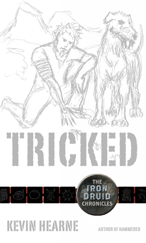
They chose a much more dramatic pose, of course (and thank goodness!), and I’m told Oberon might make an appearance on the back cover (I’m crossing my fingers), but Gene kept the buttes and also the tracks. They cropped the tracks out of the cover, and I had to crop them out for the wallpaper too, but they’re in the full illustration so I went ahead and geeked out about that.

As far as what Druidic binding looks like, I referred them to the way Atticus describes it to Granuaile in HEXED. In our normal vision we’d see nothing, but in the magical spectrum we’d see Atticus outlined in a soft white glow and then his bindings are seen as Celtic knotwork of various patterns, depending on the binding. I said these would originate from his hand and take shape from there, and wow, I’m still grinning at what a fantastic job Gene did with that! I hope you like it as much as I do! I love it!

And I suppose I should mention that TRICKED is now available for pre-order at your Indie bookstore, as well as B & N and Amazon and wherever else you buy books, and pre-ordering is one of the nicest things you can do for an author. It makes a difference!

Very happy holidays to you from me, and a Happy Solstice from Atticus!

Good Show Sir!

One of my favorite websites these days is Good Show Sir, a UK site dedicated to the absolute worst sci-fi and fantasy covers. The best bit about it is that the content is generated by random people snapping pictures of bad covers that they find in used bookstores. You can contribute too: take your camera phone next time you’re in a used bookstore and have a blast.

I am inordinately proud to have contributed to the site today. My submission of Red Flame Burning, which I found at Bookman’s in Mesa, is now up on the site, and I’m delighted that it’s rated as quite a good show indeed. When you submit, you get to have some fun imagining what the art director told the artist, or make some other pithy comment. And then, of course, people get to make all sorts of comments after that and pile on.

Want a practice one? Here’s the cover for In the Cube, a novel of FUTURE BOSTON!

See, apparently, in future Boston, several things have happened: mullets are back, Bill Belichek’s game plans (or something else equally valuable) are being stored in the Cube, and said Cube is guarded by a woman equipped with a Shoulder Mounted Assault Beaver. Also, there are no more bras.

Do you have a favorite bad cover—maybe one lurking on your own bookshelf, gathering dust?

Weekend Update

1. I’m frustrated that I can’t seem to watch Sharktopus on demand. I’ve seen the trailers and it’s chock full of ridiculous. The kind of movie where you just sit down with some friends and popcorn and laugh. I don’t troll the TV enough to catch it when it’s on the Syfy Channel, and it’s a shame, because I think it has the potential to be a B (or C) movie classic.

2. My school’s football team advanced in the state playoffs last night. They’re in the final four; it’s the best they’ve ever done. I won’t get to announce anymore, though, since it must be in a neutral location and I’m not a neutral announcer.

3. Going to see Harry Potter at some point this weekend; kid is looking forward to it, to put it mildly.

4. Author Stacia Kane put up a great post about copyright and if you’re a writer (or a reader) you should check it out.

5. My webmaster dude (IT term) is working on my site and what I’ve seen of it so far is pretty spiffy.

6. For two whole days this week, I had nothing to grade. It was awesome. But now I have a giant stack of essays to look over, so I’d better get to it.

7. All three books now have their cover art up at Amazon! And (ahem) they’re available for preorder! :)

Shiny Covers!

They didn’t tell me they would be shiny! I just got what they call sales proofs in the mail—these are what the sales folks take around to bookstores and say, “See, if you’re going to judge a book by its cover, then THIS ONE WINS!”—and the title that was previously white text is now foil stamped and embossed! I had no idea they were going to do that until my editor told me they’d gone ahead and done it. My scan doesn’t do it justice, but you’ll get the idea:

As Patrick Rothfuss would say, click to embiggen

Well, my peeps at Del Rey outdid themselves with these covers. I love ’em! They are going to gleam on the shelves! Ginormous thanks to authors Ari Marmell, Kelly Meding, and Nicole Peeler for reading the book before the awesome cover existed and saying something nice about it. That truly means the most, because they didn’t have to read it or say anything nice, yet they did.

Now here’s a better look at the cover for book two in the series:

I really dig this one because you can see Atticus’s tattoo much better; it wraps five times around his biceps and then falls down the top of his forearm, but you can’t see that in the pose for Hounded. This cover has a couple more touch-ups to go before it’s finalized, but it’s 90% there and they needed to get a proof out for the sales team. I think it looks spectacular as is! Hope you dig ’em too.

HOUNDED cover revealed!

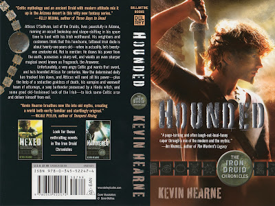
Though I suppose I could be accused of bias when I say “I LOVE IT!” it’s true nonetheless. The cover for Hounded is awesome; Del Rey has captured Atticus perfectly!

When Tricia & Mike (my spiffy editors) told me that Advanced Reader’s Editions were on their way, they made one request: have someone take pictures of me opening the box. They know I’ve been waiting to be published a long time, and to see my book bound and printed for the first time would be, in the words of our vice president,  “a big f#%!ing deal.” I agreed readily, not knowing what torture it would be…

The box arrived on Friday; I arrived soon after. BUT NO ONE WAS AROUND TO TAKE PICTURES. I couldn’t open it! I could have gone to a convenience store and made the clerk take pictures—I was thinking such things—but not seriously, because I wanted my family to be around when I opened it; they’ve been waiting a long time to see the book too. I had to wait three hours for my wife to get home, gnawing on my fingers the whole time, staring at the Box of Joy that I could not open.

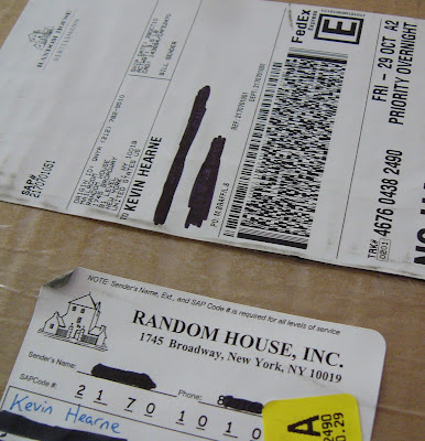
It taunted me with its Random House return address and its priority overnightness:

Do not be alarmed by my strange expression in the next picture. I’m petting the box and purring, see. Well, okay, be alarmed if you’d like.

Purrrrrr.
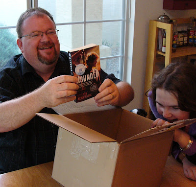
The Box of Joy finally surrendered its happy contents to me:

….Words fail. All I can say is that there’s nothing like a dream coming true, and I couldn’t be happier.
   Below is my photo of the ARE cover. I apologize for the wee bit of glare. Also, the icons on the charms aren’t really coming through on this picture—all you see are black squares—but you’ll see them “for reals” with your naked eye, and they’re sublime. I’ll have the cover art file later, but for now enjoy the ARE:

If Atticus looks at you like that and draws his sword, APOLOGIZE. It doesn’t matter for what, just tell him you’re sorry and you’ll never do it again!
I’ve said it before and I’ll say it lots more: Del Rey has been completely lovely to work with. Tricia and the art dept. deserve mad props for this cover, and for the Hexed and Hammered covers as well. They brought Atticus to life and they incorporated my suggestions beautifully; I will build them a shrine and make offerings of gummi worms and beer.
And whoa—Hounded is now available for pre-order on Amazon, Borders.com, and BN.com! They don’t have the cover image up yet, but in case you’re really itching to get a head start on buying the books you need to read in April, now you can!
In other news—yes, I have other news!—my Cage Match write-up of Gaius Baltar vs. Feyd Rautha-Harkonnen should be up sometime today on Suvudu.com, so I’d love it if you went over there and took a gander. And, should you be so inclined, please vote for Baltar! Not only is he a completely awesome villain that you love to hate, as long as he wins, I get to keep writing!
I wish you peace, if you’re into that sort of thing. Otherwise, may you be swept suddenly into a world of intrigue and learn a rune-based magic system in only three days to prevent a demon apocolypse.

Whiskey Row

This post isn’t about whiskey. But I could see how you’d think that, what with the title and all. Nope, this is about a destination.

Whiskey Row is in downtown Prescott, Arizona. It’s famous for an awful lot of rows begun by men who drank too much whiskey. And, of course, there used to be a whole row of bars there in the days when people only bathed seasonally. There still are quite a few bars there, but they’re interspersed with gift shops and scented candle stores now that people bathe more often. It tells you how far Arizona’s come in a hundred years: we used to just need booze, but now we need booze and a way to smell good afterward.

On the corner of Gurley and Montezuma is the St. Michael Hotel. It’s over a century old, which is “old” for Arizona. Teddy Roosevelt stayed there. John L. Sullivan did too, and I was told by my paternal grandmother (maiden name of Sullivan) that I’m distantly related to him somehow. (I only remembered that today, when I saw a plaque with his name on it affixed to the hotel. I sorta thought, “Wow. You know you’re famous when your sleeping arrangements get marketed to future generations.”And I might not be related to him at all—Grandma’s story might have been blarney; I think he’s someone every Irishman wishes he was related to, because he kicked a lot of ass and his mustache was epically virile.)

My supposed relation, John L. Sullivan

In any case, my family and I decided to sup in the bistro located on the ground floor of said establishment. It looked like this:

We were early so that’s why the joint looks deserted. I ordered a broiled portobello stuffed with artichoke, spinach, tomato, zucchini and parmesan spread out on a red pepper coulis. Jasmine rice and veggies on the side. It looked like this and it was nummy:

I gave the cauliflower to my daughter because I can’t eat that stuff. It looks like braaaaains.

We were visiting Whiskey Row today because there’s a very cool photographer up there named Amy Ryland, and if I absolutely must let someone take my picture, then it’s gotta be her. She found a spiffy stone wall on Whiskey Row and shot me there for my author photo. Brace yourself.

Ta-Effing-Daaa!

As promised, I eschewed the infamous and ubiquitous Author Chin Cradle. (Though I’m leaving my Profile Chin Cradle up on the right sidebar, and I’ll also continue to use it on Twitter and Facebook because it cracks me up.) I didn’t give into temptation and stand in front of a bookcase, either. Nope, this is Stone Cold Whiskey Row, and there’s a twinkle in my eye because that tends to happen when I’m in close proximity to that much whiskey.

I think you can click on the picture to enlarge it, but I’d recommend that you resist the urge, because there’s only so much cute chubby Irish guy you can handle.

My editor tells me that Advance Reader Editions of Hounded will be available sometime in December. I have no idea how many they will print or who will get them: It’s a mystery. But O, frabjous day! My cover shouldn’t be a mystery for much longer! For one thing, there will be a poster of it on display at the New York Comic Con next weekend. If you’re going to be there, stop by the Del Rey booth and check it out. :)

Cover Update and a Public Appearance Thingy

WELL!

Things are happening.

Though I can’t share what I saw because it just wouldn’t be fair, my editor sent me something that the cover artist is working on and it is jaw-droppingly cool! These days the cover artists often use photographic models on which to base their digital illustration (think Gail Carriger’s books, see this cool video on how they made the cover for her third book), and so to get themselves ready for the photo shoot they’ll construct whatever props and doodads they feel necessary for verisimilitude. What I got to see today was one of the props created for the shoot, and I cannot describe how awesome it is to see something I imagined come to life like that! I have been doing a happy dance for three hours and I think I’ve lost a couple pounds.

By the way, for a fun look at how urban fantasy covers have changed, check out this neat survey and this other article from Orbit books.

In other news, I’m going to be making my first “public appearance,” which is such a douche-y phrase that I can’t say it without laughing. But nevertheless, here it is: I’ve been asked to speak at a Writer’s Workshop on Saturday, October 9 at the East-West Exchange on 100 N. Tonto Rd. in Payson, AZ, from 1-3 pm. It’s sort of a whirlwind tour of getting published for aspiring authors, though of course I’m going to be focusing a bit on urban fantasy in particular. Come on by if you can make it, they have a great little coffee bar in there (it’s an indie bookstore) and I’ll hang out for a while.

The program will include how I discovered a niche in the market and rushed to fill it, followed by what I hope is a mildly inspirational story of how an unknown schmoe with zero connections in the industry got a three-book deal with a major publisher. I’ll walk people through the process, from market analysis to writing the book to sending out queries and landing an agent, and then discuss what I feel are some demands in the fantasy market (both urban and epic) that aren’t currently being supplied. There will be a Q & A afterward so that you can stump me.

And someday, when I can, I’ll post REAL COVER ART and I cannot wait!

Cover Musings

The typical urban fantasy cover shows us an attractive young woman in leather holding a weapon. It’s staggeringly popular and I’m not here to question why. I mean, duh, what’s not to like? But Hounded is a wee bit different from most urban fantasies in that the protagonist is male. There are a few other male protagonists out there—Harry Dresden, of course, and then the dude in Harry Connolly’s Game of Cages series and Simon R. Green’s Nightside books—but mostly, it’s a genre dominated by kickass heroines.

Not that there’s anything wrong with that.  Plenty of people want to be dominated by a kickass heroine.

But I can’t put one of those on my cover. I can’t even put my character in leather, because he doesn’t wear it, and he doesn’t wear a trench coat or a leather duster or a hat pulled low over his eyes. To make things more difficult, my main character isn’t a vampire or a werewolf—nor is he in love with a vampire or werewolf, employed in the vampire and werewolf-slaying industry, or related to a half-vampire and raising werewolves in the basement. He is, in fact, a Druid—but not the kind with giant beards and white robes.

So. How does one design a cover for such a character? How does one come up with something that will appeal to fans of the genre? Well, stay tuned. People smarter than me at Del Rey are figuring it out, and you can be sure I’ll post it here when it’s available. But I think it’s safe to reveal two things at this point:

1. There will be no purple.
2. There will be no man boobs.

And I will not apologize for those things, because they are wrong.